Choosing yarn colors should feel exciting—not overwhelming. But if you’ve ever stood in front of a wall of yarn wondering “Do these actually go together?”, you’re not alone.
Have you ever bought yarn because the colors looked perfect in the skein? I know I have.
Then you started crocheting, and somewhere around row twelve, you realized something was not looking quite right. The colors that looked dreamy in your hand now look muddy, or maybe they’re fighting each other, or worse, your beautiful texture stitch has completely disappeared. The problem isn’t your skill level or the pattern itself.
It’s that choosing yarn colors that actually work together is a skill nobody teaches you, and the stakes are higher than you think. Bad color choices can make even advanced stitches look sloppy, while smart pairings can make beginner-level work look like it belongs in a boutique.
The truth is, beautiful color combinations aren’t about luck or talent. They come down to a few simple principles you can use again and again. Once you understand them, you’ll be able to confidently mix, match, and create yarn palettes that look polished and intentional every time.
Let’s walk through exactly how to choose yarn colors that truly work together.
Simple Tips for Beautiful Crochet & Knitting Projects
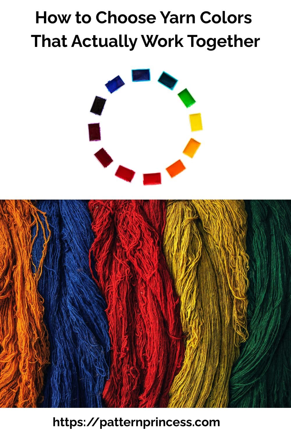
Table of contents
- Why Yarn Color Choice Matters
- Why Your Yarn Colors Look Totally Different After You Start Crocheting
- Start with a Simple Color Plan
- How to Pick Two or Three Colors That Won’t Fight Each Other
- What Is a Triadic Color Palette?
- Light–Medium–Dark Contrast Chart
- Beginner-Friendly Color Palettes That Work Every Single Time
- Harvest Fall Color Combinations
- Easy Formula for Foolproof Color Palettes
- Why Some Colors Make Your Stitches Completely Disappear
- The Biggest Yarn Color Mistakes and How to Avoid Them
- Where to Find Yarn Color Inspiration (Without Overthinking It)
Why Yarn Color Choice Matters
Color is one of the most powerful design elements in crochet and knitting. The right palette can:
- Highlight stitch patterns
- Make simple designs look stunning
- Create mood (calm, cozy, bold, seasonal)
- Turn a basic project into something eye-catching
Even the most beautiful pattern can fall flat with the wrong colors, while a simple stitch can shine with the right palette.
Why Your Yarn Colors Look Totally Different After You Start Crocheting
What Changes from Skein to Stitches?
- Surface area expands
- Light hits it differently
- Stitch texture matters
That skein looked like soft butter yellow in the store, and now it’s screaming neon on your blanket. This happens to everyone, and it’s not your eyes playing tricks on you.
Yarn in a skein is tightly wound, which means you’re seeing dozens of layers of color stacked on top of each other. That creates depth and richness that completely vanishes the second you start working it up into single rows or rounds.
A dark plum that looked moody and sophisticated becomes flat purple. A variegated skein that had gorgeous pooling of blues and greens turns into chaotic stripes that make you want to frog the whole thing.
Here’s what changes when you go from skein to stitches:
- Surface area expands – That color spreads out across a much larger space, which makes it look lighter and less saturated than it did in the ball.
- Light hits it differently – Wound yarn has shadows and dimension. Flat crochet fabric reflects light evenly, which can make colors look completely different depending on your lighting.
- Stitch texture impacts color perception – A highly textured stitch like bobbles or cables will create shadows that darken your yarn, while a flat single crochet will make it look lighter and sometimes washed out.
If you want to avoid this, do a test swatch in the actual stitch pattern you’re planning to use, then look at it in the room where the finished item will live. That five-minute swatch will save you from spending twenty hours on a project you hate.
Do You Need to Understand Color Theory?
Not really. While color theory can be helpful, most crocheters and knitters get better results by using simple formulas and real-world inspiration—like yarn lines, curated bundles, and palettes found in nature.
Start with a Simple Color Plan
Instead of grabbing random skeins, begin with a plan. You can still use your favorite colors. You just might pair them with different colors that you may have never considered before.
The easiest method?
Pick a “Main” Color First
Choose one base color you love—this becomes your anchor or your primary color.
Then build around it:
- 1–2 supporting colors
- 1 accent color (optional pop)
This approach keeps your palette balanced and intentional instead of chaotic.
How to Pick Two or Three Colors That Won’t Fight Each Other
You don’t need a degree in color theory to make colors look good together. You just need to stop throwing random pretty colors into a cart and hoping they’ll magically cooperate.
Most beginners make the mistake of choosing colors they love individually without thinking about how they’ll interact. That’s how you end up with a sage green, a coral pink, and a burnt orange that all scream for attention and make your project look like doesn’t quite come together.
Use these three pairing strategies instead:
- Analogous colors (next to each other on the color wheel) – Think sage green, teal, and dusty blue. These create a harmonious, calming look because they share underlying tones. Perfect for blankets and wearables where you want a cohesive, sophisticated vibe.
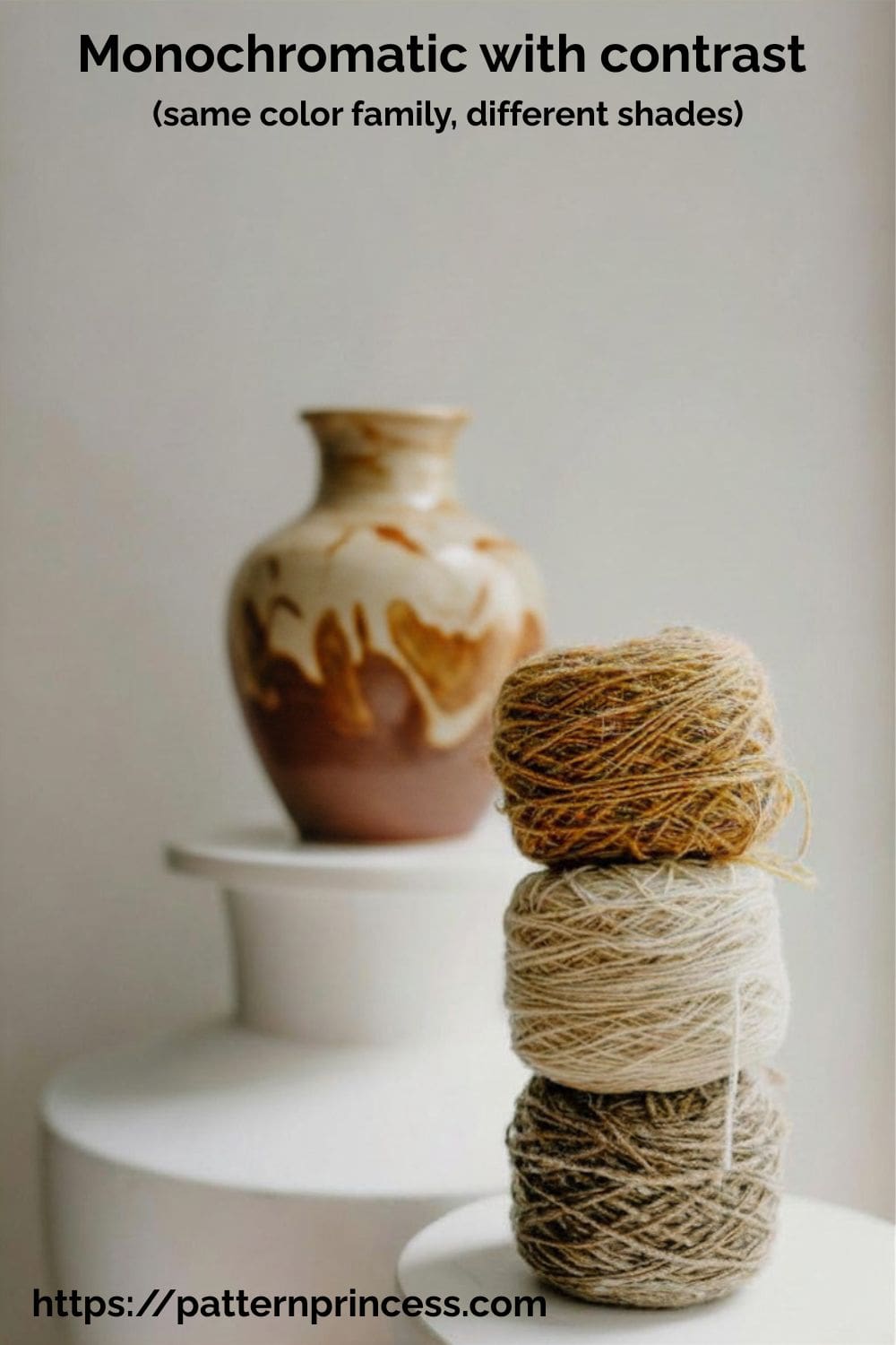
- Monochromatic with contrast (same color family, different shades) – Cream, taupe, and chocolate brown. Or blush, rose, and burgundy. This is the easiest way to look like you know what you’re doing because the colors are already related. The key is making sure you have enough contrast between the lightest and darkest shades, or everything will blur together.
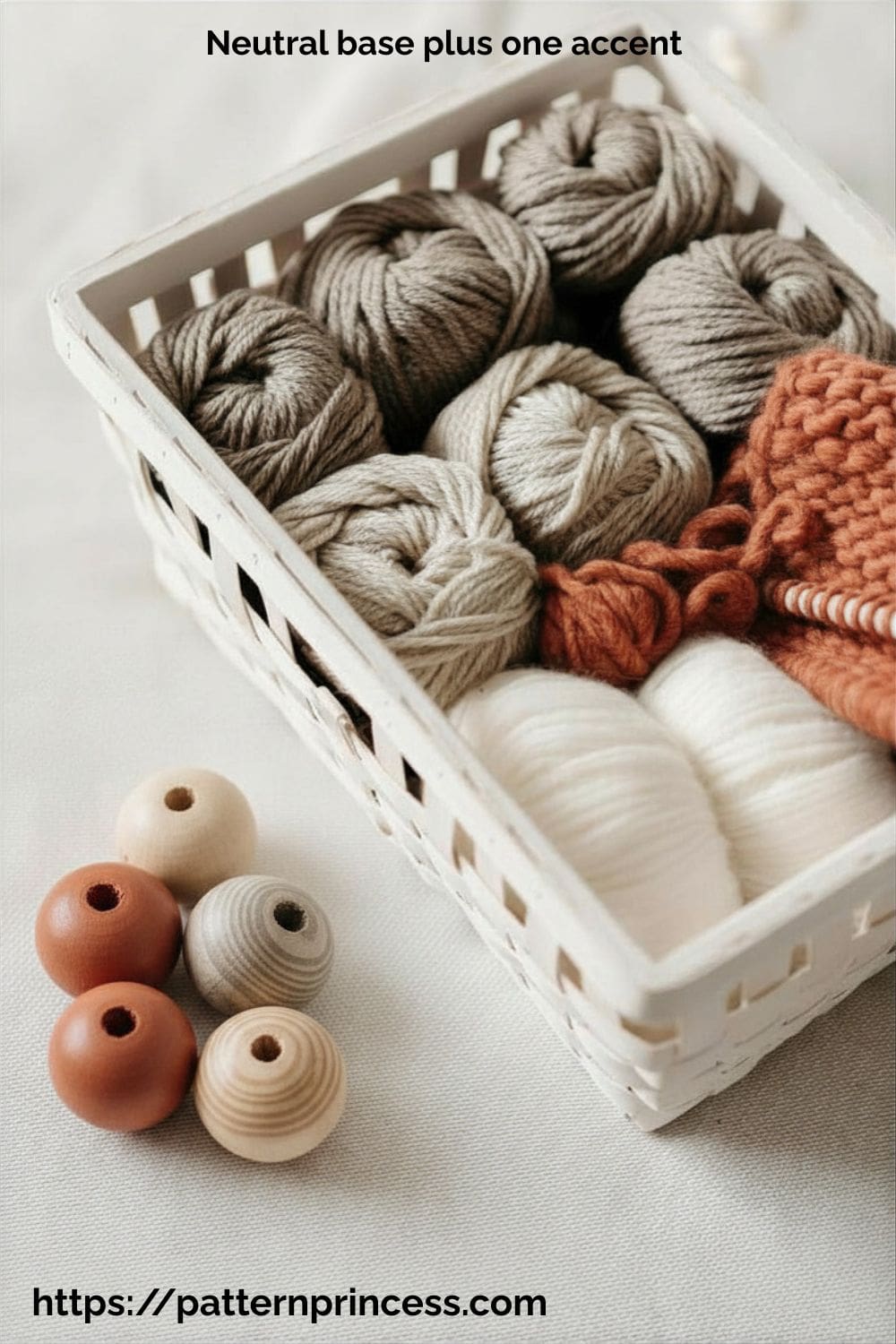
- Neutral base plus one accent – Pair a soft neutral like oatmeal or gray with one bold color like mustard yellow or terracotta. The neutral does the heavy lifting and lets the accent color pop without overwhelming the whole piece. This works especially well for garments where you want visual interest without looking like a circus tent.
If you’re stacking three colors, follow this ratio:
- 60% dominant color
- 30% secondary color
- 10% accent
What Is a Triadic Color Palette?
A triadic palette = 3 colors spaced evenly on the color wheel
Think of it like forming a triangle across the color wheel.
The key to making it work in yarn projects:
- Let one color dominate
- Use the other two as support + accent
- Add a neutral if needed to soften
That keeps one color from overpowering the others while still giving you visual interest. And if you’re ever unsure, pull up a photo of something you love (a room, a painting, a sunset) and match the color proportions you see there.
Triadic Color Palette Examples for Yarn Projects
Bold Primary Triad (Classic & High Contrast)
Colors: Red • Yellow • Blue
Best for: Kids blankets, playful projects, statement pieces
Tip: Soften this by choosing muted versions (brick red, mustard, denim blue)
Soft Modern Triad (Beginner-Friendly)
Colors: Sage Green • Dusty Coral • Soft Lavender
Best for: Wearables, baby blankets, spring projects
Tip: Keep all tones muted so they feel cohesive instead of loud
Earthy Triad (Warm & Cozy)
Colors: Rust • Mustard • Deep Teal
Best for: Fall décor, blankets, farmhouse style
Tip: Let rust or mustard dominate, and use teal sparingly
Jewel Tone Triad (Rich & Dramatic)
Colors: Plum • Emerald • Gold
Best for: Statement blankets, holiday projects
Tip: Add cream or gray to balance the richness
When to Use Triadic Palettes
They work best when you want:
- A colorful but balanced look
- More interest than neutrals
- A palette that feels intentional, not random
They’re perfect for:
- Granny square blankets
- Striped afghans
- Colorwork patterns
Pay Attention to Color Tone (This Is a Game-Changer)
Two colors can technically “match” but still look off together. Why?
Because of tone.
- Warm tones: golden, earthy, cozy
- Cool tones: icy, muted, calm
Try to keep your palette consistent:
- Warm + warm
- Cool + cool
Mixing tones can work—but it’s trickier and less predictable.
Use Contrast So Your Work Doesn’t Look Flat
One of the most common mistakes? Choosing colors that are too similar in value.
If everything is the same lightness or darkness: Your project can look dull or “muddy”
Instead, aim for:
- Light + medium + dark shades
This creates depth and helps your stitches stand out.
Light–Medium–Dark Contrast Chart
| Value Level | What It Looks Like | Example Colors | Why It Matters |
| Light | Pale / soft | Cream, blush, sky | Brightens and highlights |
| Medium | Balanced tone | Denim, sage, mauve | Adds body and balance |
| Dark | Deep / rich | Navy, charcoal | Creates depth and contrast |
A good palette includes at least one of each.
Match Your Colors to the Project
Not every palette works for every project.
- Baby blankets → soft pastels
- Fall décor → warm earth tones
- Wearables → neutrals or muted shades
- Statement pieces → bold contrasts
Think about where and how the finished piece will be used.
Beginner-Friendly Color Palettes That Work Every Single Time
If you’re still building your color confidence, start with pre-tested palettes that are nearly impossible to mess up.
These aren’t trendy or flashy, but that’s exactly why they work. They’re based on colors that naturally show up together in the real world, which means your brain already registers them as “correct” even if you don’t know why.
Farmhouse Neutral Color Selections
Cream, taupe, soft gray. This is your fail-safe palette for blankets, pillows, and anything that needs to look expensive and timeless. The lack of bold color means your stitch work becomes the star. Use this when you’re trying a new complicated stitch pattern and you don’t want color stealing focus.
Garden Spring Colors of Yarn
Sage green, blush pink, butter yellow. Soft, fresh, and feminine without being overly sweet. This palette works beautifully for baby items, spring garments, and lightweight throws. The key is keeping all three colors muted, not letting any of them get too bright or saturated.
Harvest Fall Color Combinations
Rust, mustard, deep forest green. Warm, earthy, and rich. This combo works year-round but especially shines in fall and winter projects. The colors have enough contrast to stay distinct but share warm undertones that keep them feeling cohesive.
Pick one of these palettes and stick with it for your next crochet project. You’ll start to notice what works, what doesn’t, and how different yarns behave within the same color family. That hands-on experience is worth more than any color wheel chart.
Every color combination starts with the basics: primary colors (red, blue, yellow) and the secondary colors they create (green, orange, purple), which is exactly what these color pairing strategies are built on.
Tertiary colors are made by mixing a primary color with a nearby secondary color—like blue-green or red-orange—and these are often the softer, more nuanced shades you see in yarn collections.
Yarn Color Selection Combination Cheat Sheet
| Color Strategy | What It Means | Example Palette | Best For |
| Monochromatic | Same color, different shades | Cream, taupe, chocolate | Textured stitches, blankets |
| Analogous | Colors next to each other | Blue, teal, green | Wearables, calming projects |
| Neutral + Accent | Base neutral + one bold color | Gray, cream, mustard | Modern, farmhouse style |
| Complementary | Opposite colors | Blue + orange | Bold statement pieces |
Test Before You Commit
This is one of the best tips (and often skipped):
- Lay your yarns together
- Make a small swatch
Colors can look completely different:
- In natural vs indoor light
- In stitches vs in a skein
Even experienced makers rely on this step.
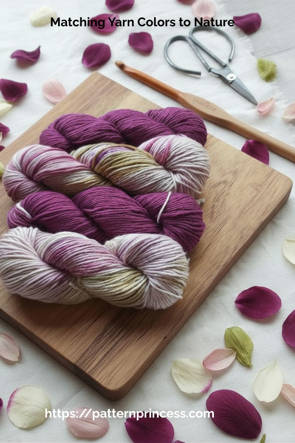
Use Nature and Photos for Inspiration
If you ever feel stuck, don’t overthink it—look around.
Some of the best color palettes come from:
- Nature (flowers, forests, sunsets)
- Seasonal décor
- Clothing you already love
Nature naturally creates balanced color combinations, making it one of the easiest ways to find palettes that work.
Easy Formula for Foolproof Color Palettes
If you want a quick shortcut, try this:
The 3–5 Color Rule
- 1 main color
- 1–2 supporting colors
- 1 neutral
- 1 optional accent
This creates balance without overcomplicating things—and works for almost any project.
Foolproof 3–5 Color Formula Chart
| Role | Purpose | Example |
| Main Color | Dominates the project (60%) | Soft cream |
| Supporting Color | Adds interest (30%) | Warm taupe |
| Neutral | Balances bold tones | Light gray |
| Accent | Small pop (10%) | Mustard |
What to Do with Leftover Yarn from Your Color Palette
- Save for scrap blankets
- Use in granny squares
- Create coordinated accessories
Why Some Colors Make Your Stitches Completely Disappear
You spent hours on a gorgeous cable pattern, and in the final product, you can’t see a single twist.
This is one of the most frustrating mistakes, and it happens because of one thing: lack of tonal contrast. Your stitches create texture through shadows and depth, but if your yarn color doesn’t reflect light in a way that highlights those shadows, the whole stitch pattern flattens out and vanishes.
Here’s when your stitches will disappear:
- Dark yarn in textured stitches – Black, navy, deep plum, or charcoal will eat up detail. The shadows your stitches create get lost because the whole surface is already dark. If you’re doing a complex stitch, go lighter.
- Variegated yarn in busy stitch patterns – If your yarn is already doing a lot (color shifts, pooling, long color changes), your stitch pattern won’t read. The eye doesn’t know where to focus. Save variegated yarn for simple stitches like single crochet or half double crochet.
- Light yarn in simple stitches – The opposite problem. Cream or white yarn in basic stitches can look flat and boring because there’s no shadow or depth to create interest. If you’re using a light neutral, pick a stitch with texture like puff stitches, popcorns, or shells.
If you’re committed to a dark yarn, test your stitch in good lighting before you commit to a whole project. And if you’re doing colorwork or stripes, make sure your colors have enough tonal contrast that the pattern will actually show up.
Hint: Hold them next to each other and squint. If they blur together, pick a lighter or darker option for one of them.
The Biggest Yarn Color Mistakes and How to Avoid Them
Even experienced crocheters fall into these traps, and they’ll quietly ruin a project before you realize what went wrong.
Mistake one: Too many bold colors competing for attention. You love teal, hot pink, and bright yellow, so you throw them all into a granny square blanket. The result can feel a little chaotic. Bold colors need space to breathe. Limit yourself to one or two bold shades and surround them with neutrals that let them shine.
Mistake two: Not enough contrast between your colors. You pick three colors that are all mid-tone (medium blue, medium gray, medium pink), and the finished project looks washed out and boring. Every palette needs a light, a medium, and a dark to create visual interest. If all your colors are the same value, nothing will pop.
Mistake three: Variegated yarn pooling in ugly ways. Pooling happens when the color repeats in your variegated yarn line up in unintentional patterns, usually blotchy circles or awkward stripes. The only real fix is switching to a different stitch pattern (try moss stitch or corner-to-corner) or switching to a smaller or larger hook to change how the colors land. You can’t control pooling, but you can work around it.
The fix for all of these is simple: plan before you buy. Lay your yarn choices next to each other in the store. Take a photo in natural light. Look at them together for a full thirty seconds, not just individually. If something feels off, it probably is.
The more projects you make, the easier it becomes—and before long, you’ll start putting together color combinations that feel effortless and uniquely yours.
The Easiest Shortcut: Let the Yarn Do the Work
- Choose colors from the same yarn line
- Use curated yarn packs
- Start with variegated yarn + a neutral
When in doubt, trust combinations that have already been put together for you. It’s a great place to start color pairing. While I love a single color project, finding that right balance of colors can truly change the look and feel.
Where to Find Yarn Color Inspiration (Without Overthinking It)
1. Yarn Lines from the Same Collection
You don’t need perfect color theory knowledge to make beautiful projects. You just need to slow down, test your ideas, and trust your gut when something isn’t working. The more you practice pairing colors, the faster your instincts will develop, and soon you’ll be pulling combinations that make people ask where you learned to do that.
Most yarn brands design their color lines to work together on purpose.
Why this works:
- Colors share undertones
- Saturation levels are consistent
- Designed for multi-color projects
If you’re unsure, pick 3–5 colors from the same yarn line. The brand has already done the hard work for you.
2. Curated Yarn Color Packs
These are becoming more popular—and they’re basically “done-for-you” palettes.
Look for:
- Mini skein sets
- Gradient kits
- Blanket kits
Why they’re great:
- Professionally curated
- Balanced contrast
- Perfect for beginners
3. Local Yarn Store Displays
Don’t overlook this one—it’s underrated.
A yarn shop often:
- groups colors intentionally
- displays seasonal palettes
- creates sample projects with the right color combinations of coordinated yarns
Tip: If you see a display you love, take a quick photo for reference later. I do this all the time with both fabrics and yarn. It’s a simple way to build a color palette library of ideas.
4. Variegated Yarn (Built-In Color Palette)
Variegated yarn already contains:
- multiple coordinated colors
- balanced transitions
- built-in harmony
Pairing multicolored yarn with a neutral yarn often creates gorgeous results.
How to use it:
- Let variegated yarn be the star
- Pair with cream, gray, or beige
- Keep stitches simple so colors shine
5. Photos You Already Love
- Nature has beautiful palettes
- Home décor statement piece
- Clothing with a beautiful color combo
If you love the colors in something, you can recreate that palette with yarn.
Try starting with just one color you love and build from there. Keep it simple, test your combinations, and trust the process. Beautiful color palettes don’t happen by accident—they’re built step by step.
Around here, we believe creating should feel peaceful, not frustrating. Choosing yarn colors is part of that process—something to enjoy, experiment with, and grow into over time. We hope this has inspired you to have some fun choosing yarn colors for your next project.

You can find Victoria crocheting, quilting, and creating recipes. She has cooked in restaurants for over 20 years, including many larger parties. She learned to crochet when she was just 11 years old and has been crocheting ever since; over 50 years now. Over 40 years ago, she loved her first class in sewing and continues to hone her skills in quilting. Many have enjoyed the handmade gifts over the years. In her professional career, she has worked in management in a wide variety of businesses including higher education as a dean of a division. All the while attending college part-time to achieve her doctorate in higher education with an emphasis in e-learning.